

Visualising Quantitative Data:
An Overview Of Internet In Mexico
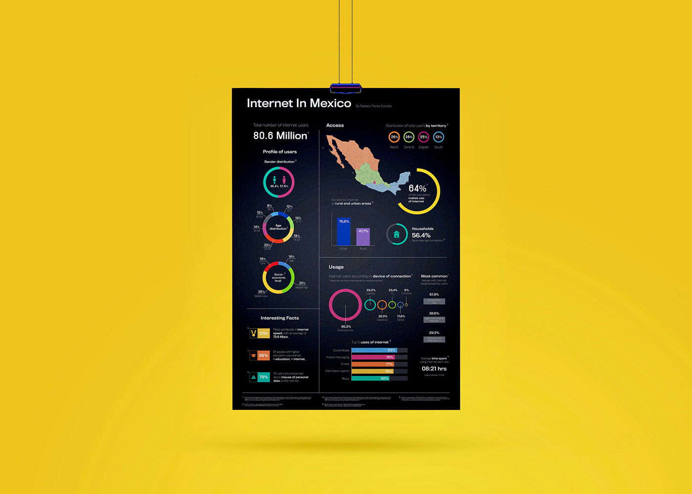
I developed a one-page infographic of quantitative data on the internet in Mexico. A comprehensive overview of the profile of users, territorial access, usage, and interesting facts. I decided to go for a dark background that would add sophistication and formality to the visualisation, yet complemented it with a colourful palette, reminiscing of Mexico, to be used across the graphs.
As I was dealing mostly with percentages, I used donut graphs to represent the different distribution, bar graphs to demonstrate the extent of certain data points, and scales of circular shapes to make comparisons visible. For other concrete data points I chose a simple text display.
First infographic I've ever done and I truly enjoyed it. From research, data analysis, selection, visual composition and illustration. An extensive design process that leads to practical applications of data in a visually compelling way.
Take a closer look below:


